Introduction
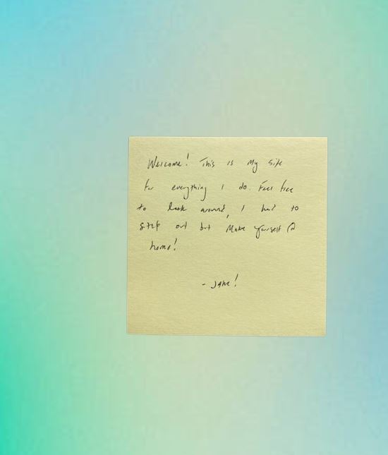
I decided to be ambitious and make 30 videos in 30 days, documenting the creative programming projects I built over that time.
Monochrome CV
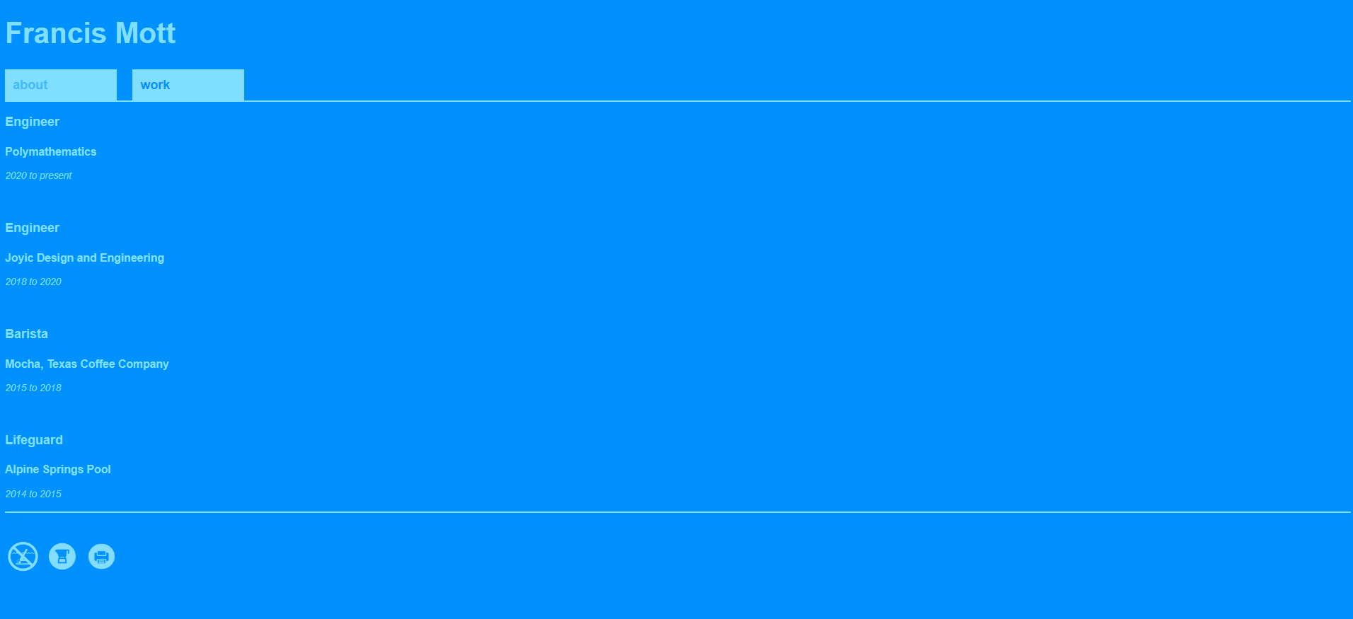
A simple site to showcase your work, with three CSS themes: No Diving, Mokapot, and Office.
Twist and Shout
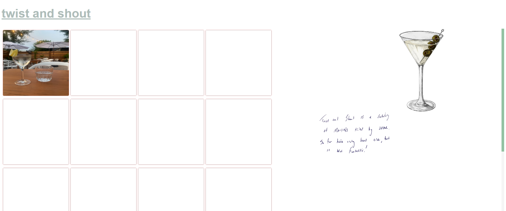
A simple site to log the many martinis I plan on trying.
Scrolling Portfolio
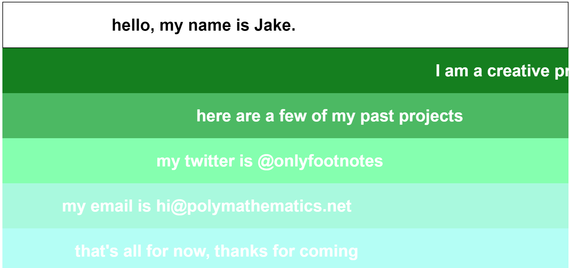
A colorful experiment with scrolling text. I wanted this to feel simple yet chaotic.
Hype Reel
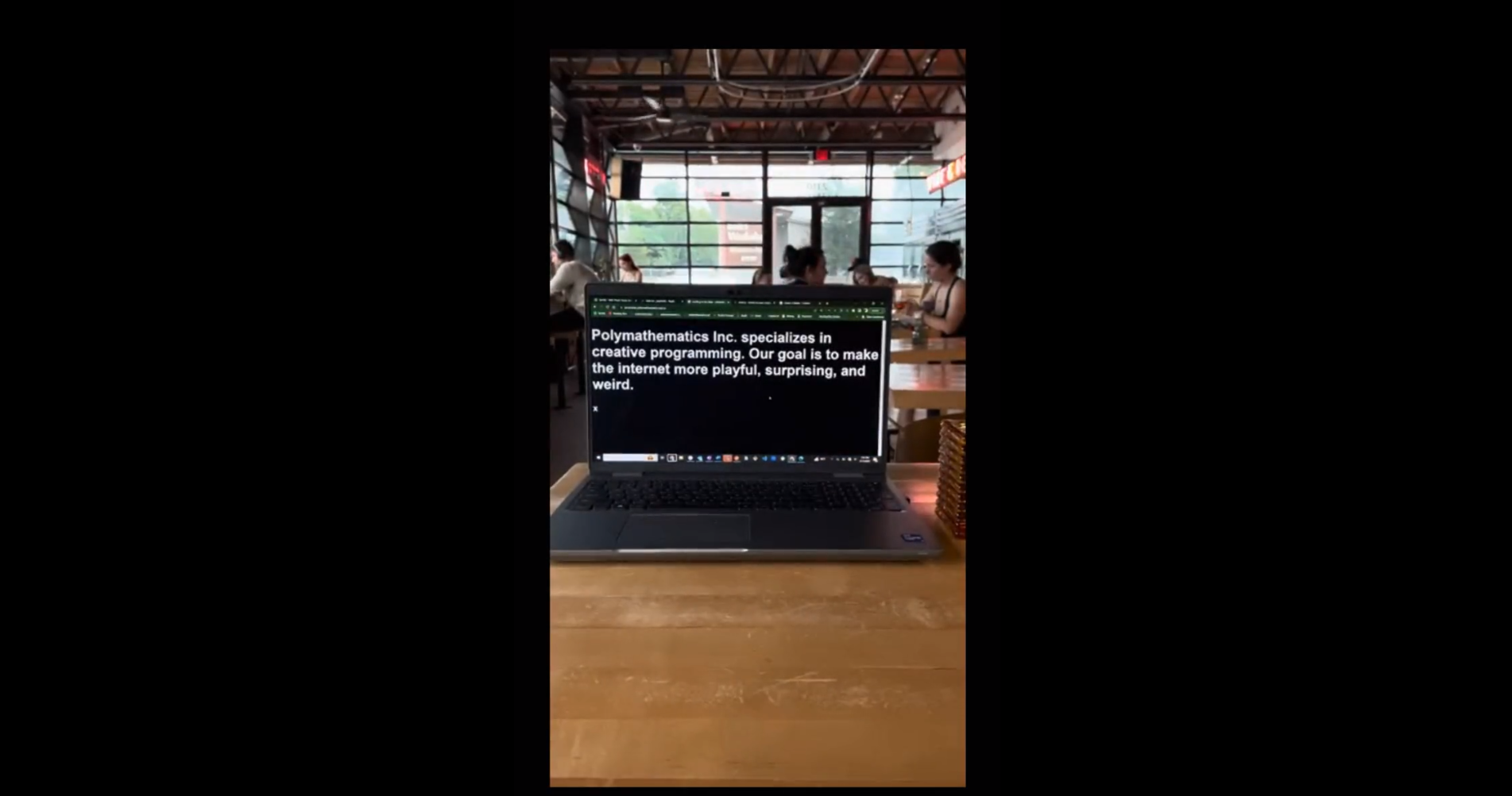
A fun video showcasing some of my work. Had fun making a quick buzzy tune for the video after having a hard time finding one with the vibe I wanted.
Weekend Inspiration 1
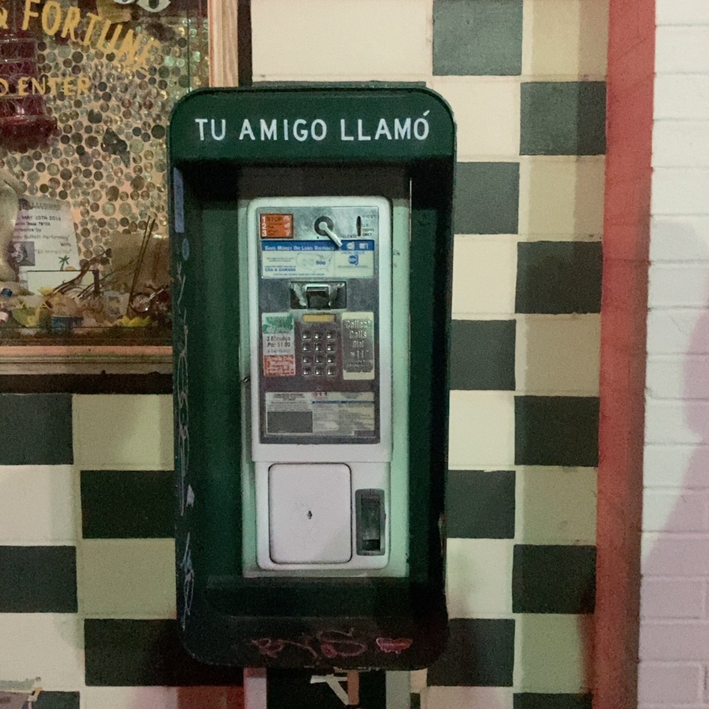
On the first Saturday of the challenge, I decided the weekend's would be for gathering inspiration to "refill" my creative well.
The Internet Payphone
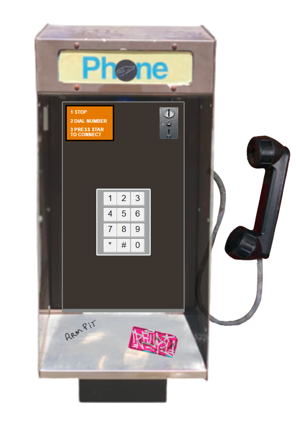
Inspired by a broken payphone outside of a local bar, I had the idea for the internet payphone, a way to call the websites you want to visit.
The Weather Station

After our AC broke on the first day of summer, I was inspired to create a website that shows you the weather by simply changing the color of the page.
I took inspiration from a 1984 Mac Control Panel design. Built with the free weather API.
Letter Board
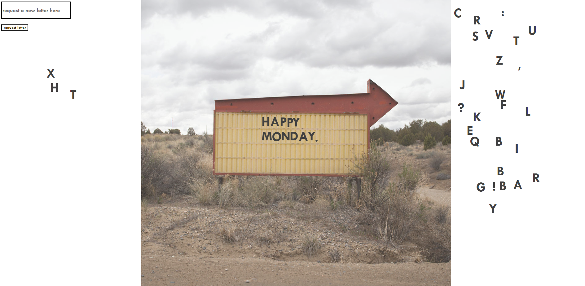
I had the idea for a virtual letter board that let any visitor update the message displayed. I also wanted to figure out how to make elements draggable.
It was tricky persisting the positions of the letters, but local storage did the trick. You'd need a database for the true concept to work.
Weekend Inspiration 2
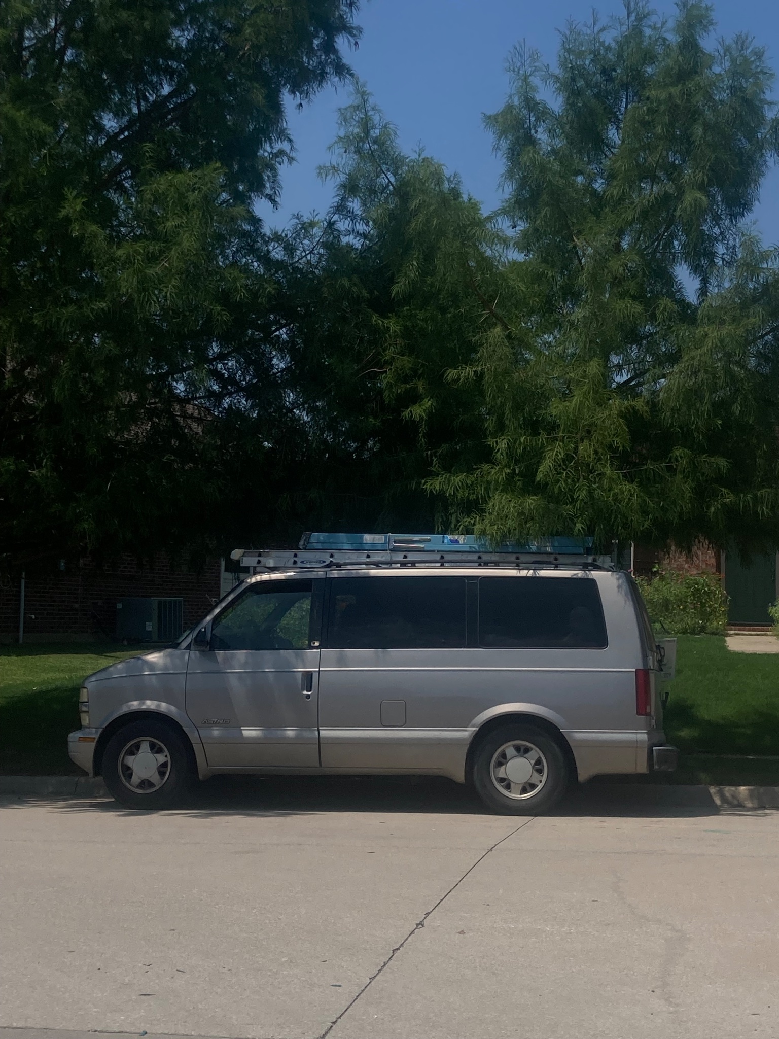
On the second weekend of inspiration, I was drawn to utility vehicles, road signs, and other functional designs.
Beach Comber
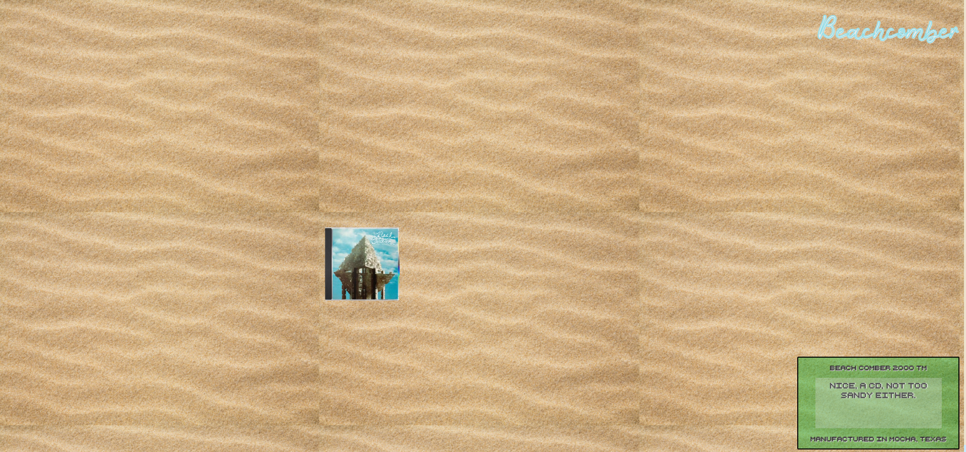
I was inspired by my favorite Real Estate song, Beach Comber. This is a site where you have to use your mouse (a metal detector) to search the sand for the site's content.
Business Casual
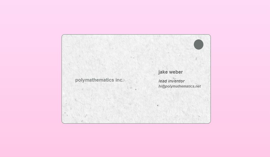
I wanted to work with CSS animations and practice div alignment so decided to make a simple virtual business card template that flips when you hover / click.
iPodify
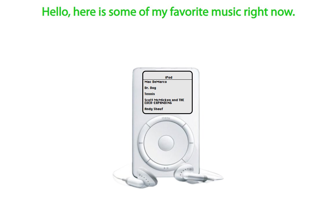
iPodify turns your Spotify into a generation one iPod User Interface. You can view your top artists and tracks from the last month and click on them to open them in Spotify.
The idea is that this would be a fun way to share your favorite music with other folks, either as an embed on your site or sending the link directly.
Built with the Spotify API, it was challenging and fun to figure out authorization stuff. If you want to try it, let me know and I'll add you to the Spotify app user list.
ice cream truck footer
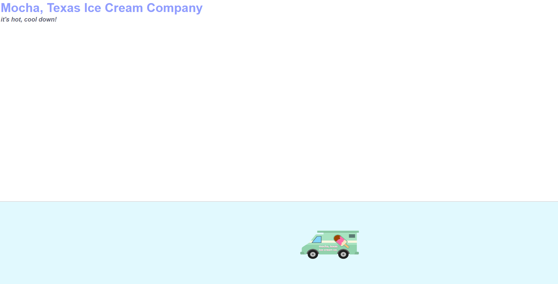
After iPodify, I wanted a project that was short and sweet. I had the idea (from weekend 1 inspo)
for a footer anyone could add to their site where an ice cream truck would periodically stop by. This was pretty straight forward CSS animation stuff,
and I had to figure out how to get around the browser preventing audio from auto-playing to get the engine sounds and ice cream truck song to play.
Weekend Inspiration 3
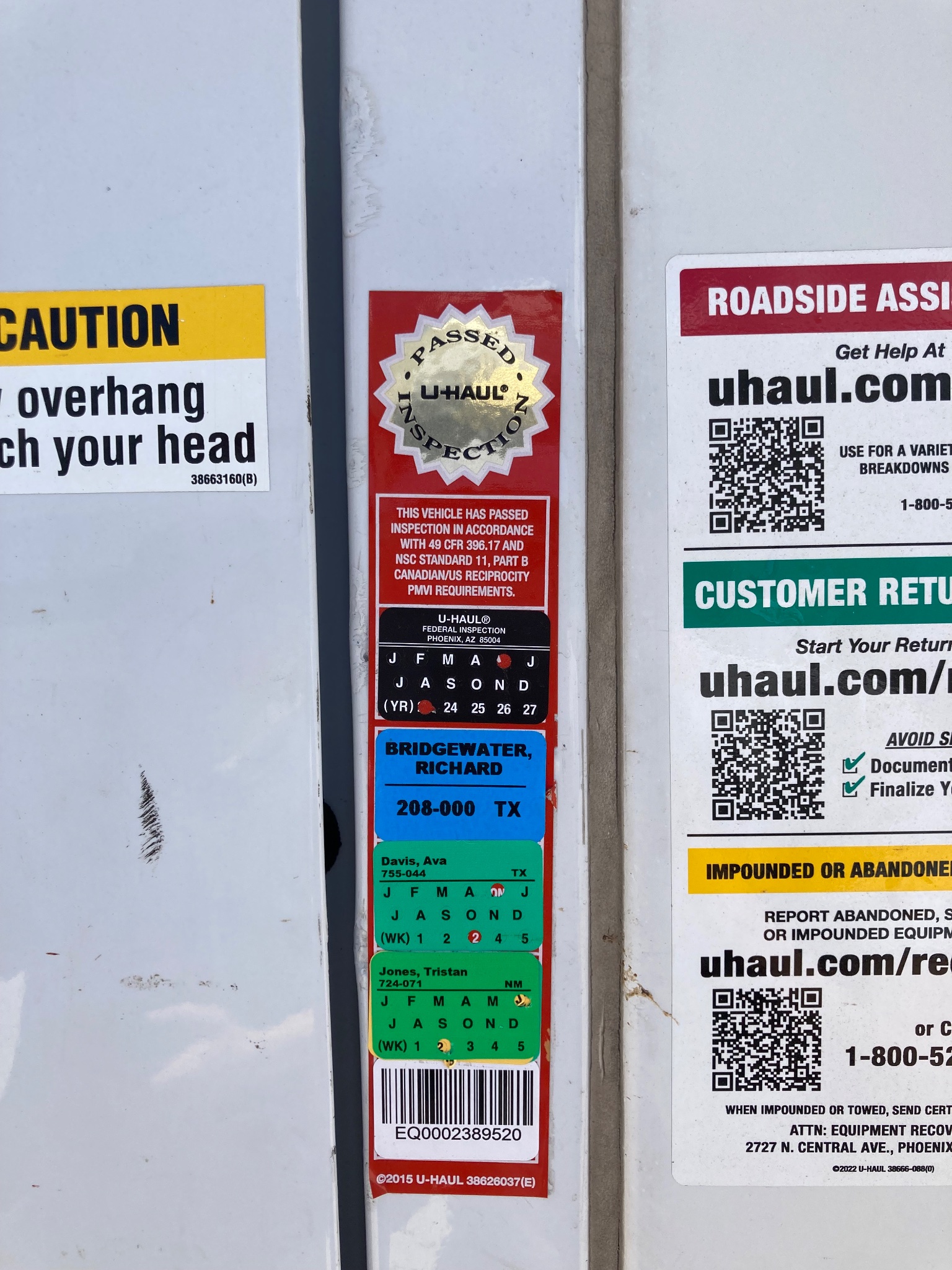
During this weekend we were helping my younger brother move. I took a lot of inspiration from our UHAUL truck
(the colors on these inspection stickers are so good) and other moving related designs.
The Hovertone
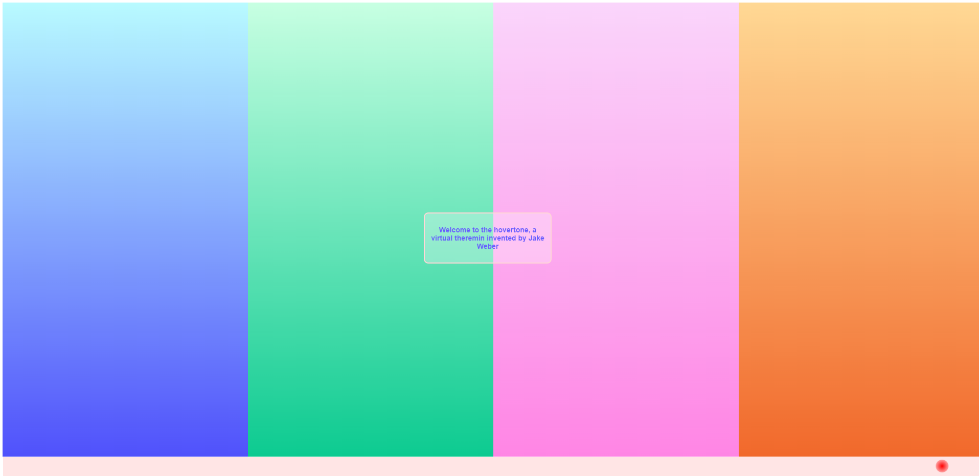
On day 22 I invented a new instrument called the Hovertone. The Hovertone is played by moving your mouse across your screen.
Changing your vertical position changes pitch, changing your horizontal position changes your chords. To reset your layer, there is a horizonal clear bar.
4th of July Inspiration Day
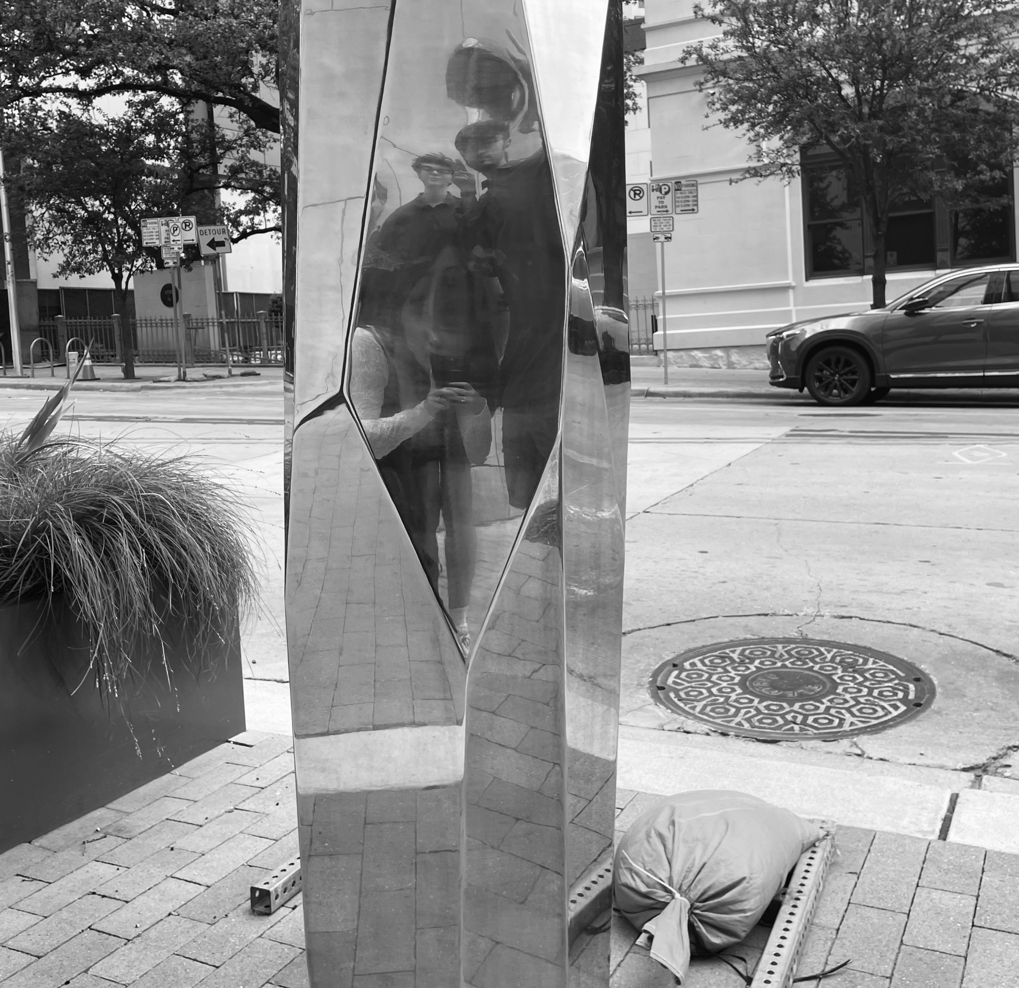
On the 4th (and a friend's birthday) I took another inspiration day. I was drawn to low lighting, city scapes, and reflections.
Joiner v1
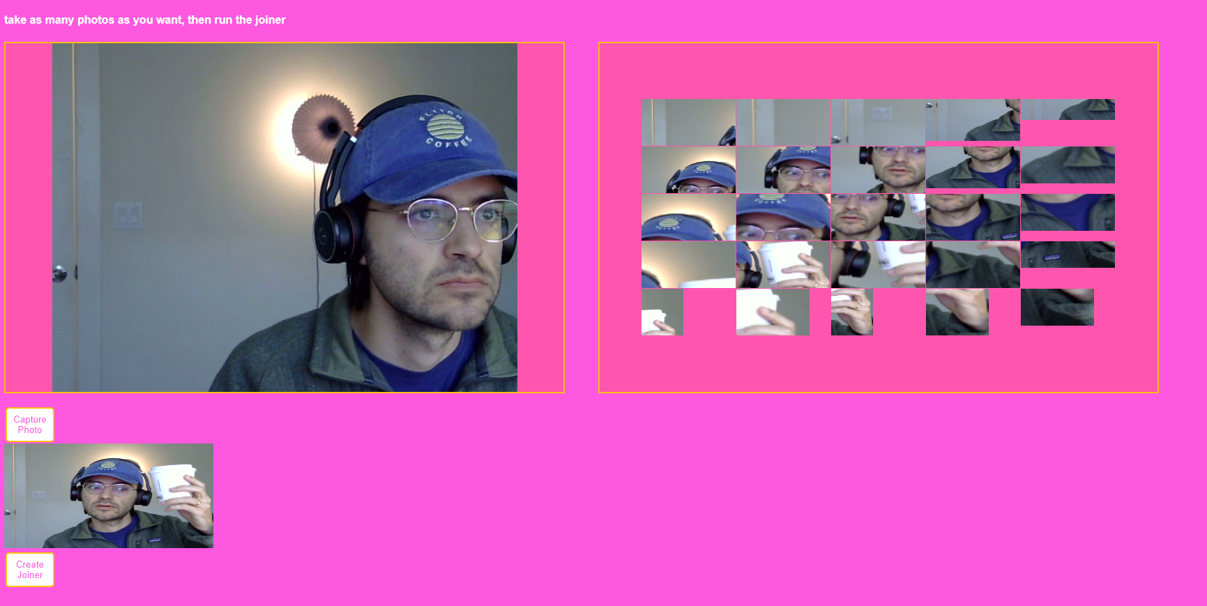
Inspired by David Hockney's "Joiners", I wanted to build a camera that created collage joiners from a single photo. Was super fun building my first app that can access a user's camera.
I began experimenting with photos immediately that evening.
Joiner v2
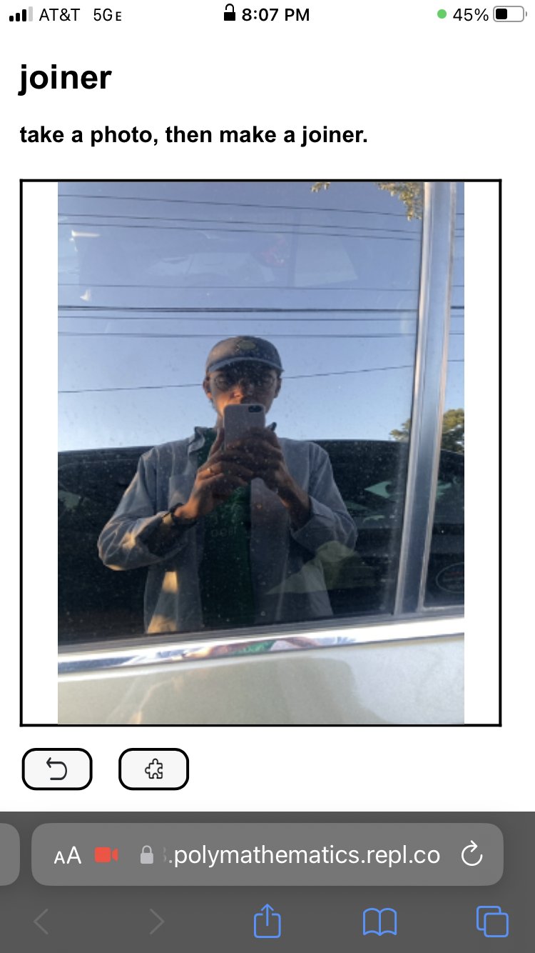
After the previous day's experiments, I knew I wanted to make Joiner better for mobile. I simplified the UI/UX and refined the joiner function to make them closer to Hockney's.
Weekend Inspiration Four
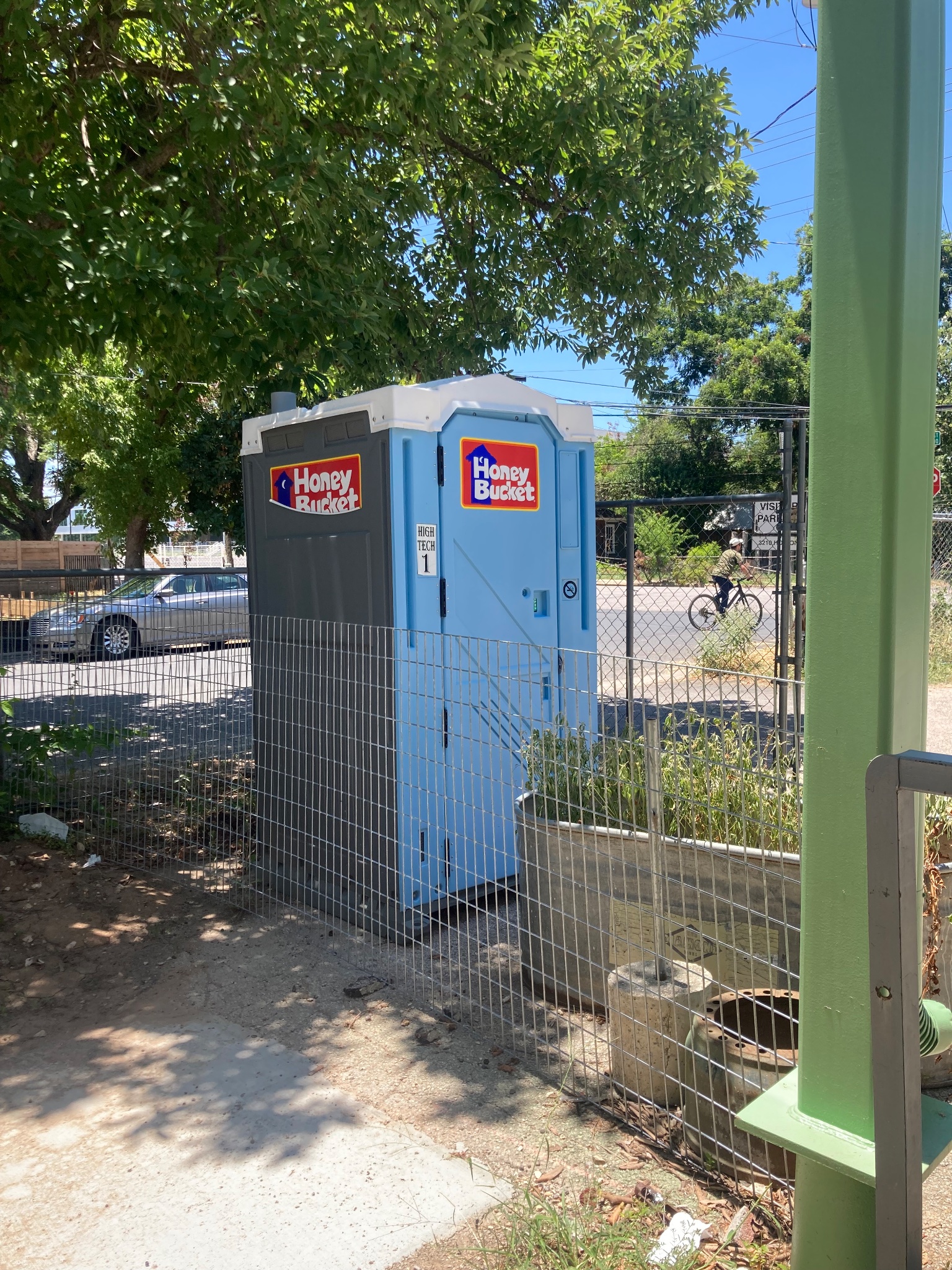
The last inspiration day. Focused on color combinations I liked.
30 days of creative programming
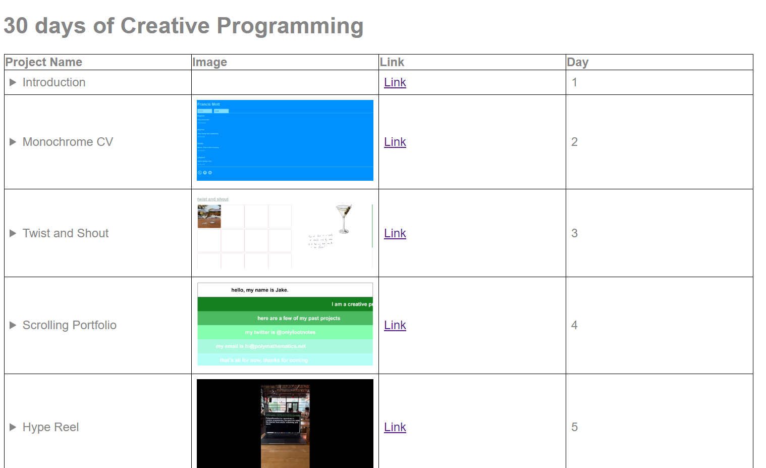
For my final project, I wanted to build an extremely minimal site to showcase the projects from these last 30 days. This is that site.